In today's world, modern web apps must be able to adapt to various devices and screen sizes. While Media Queries are helpful, ensuring they work well across all screen sizes can be time-consuming.
This is where container queries come in, as they allow us to apply a micro layout approach to individual components. With container queries, a component can have all the details about its responsive behavior built-in, making it more suitable for component-based architecture designs. This means that instead of thinking about a component's behavior in terms of screen size, we can design it based on the size available to the component itself.
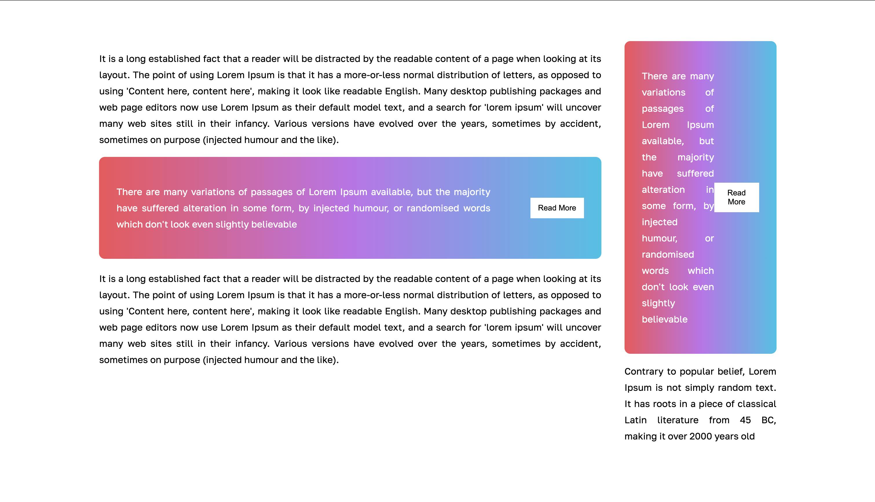
Let's consider the following screenshot,

The two colored cards are the same component, which is being placed on different containers of different widths. As per normal behavior, the content in the card is trying to render in the same way, but due to the difference in the width available the UI breaks.
This is a typical example where we can apply the container queries going forward.

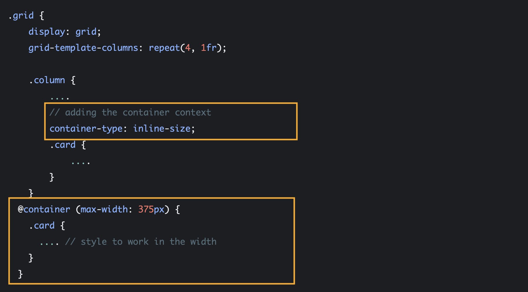
To apply the container query on any component, we have to define the container for it. In this case, the .column class is the container for the .card (The colored card in the first image is denoted here with .card class).
The property called container-type is used to define the container and the value inline-size is used when the inline dimension of the container is in use.
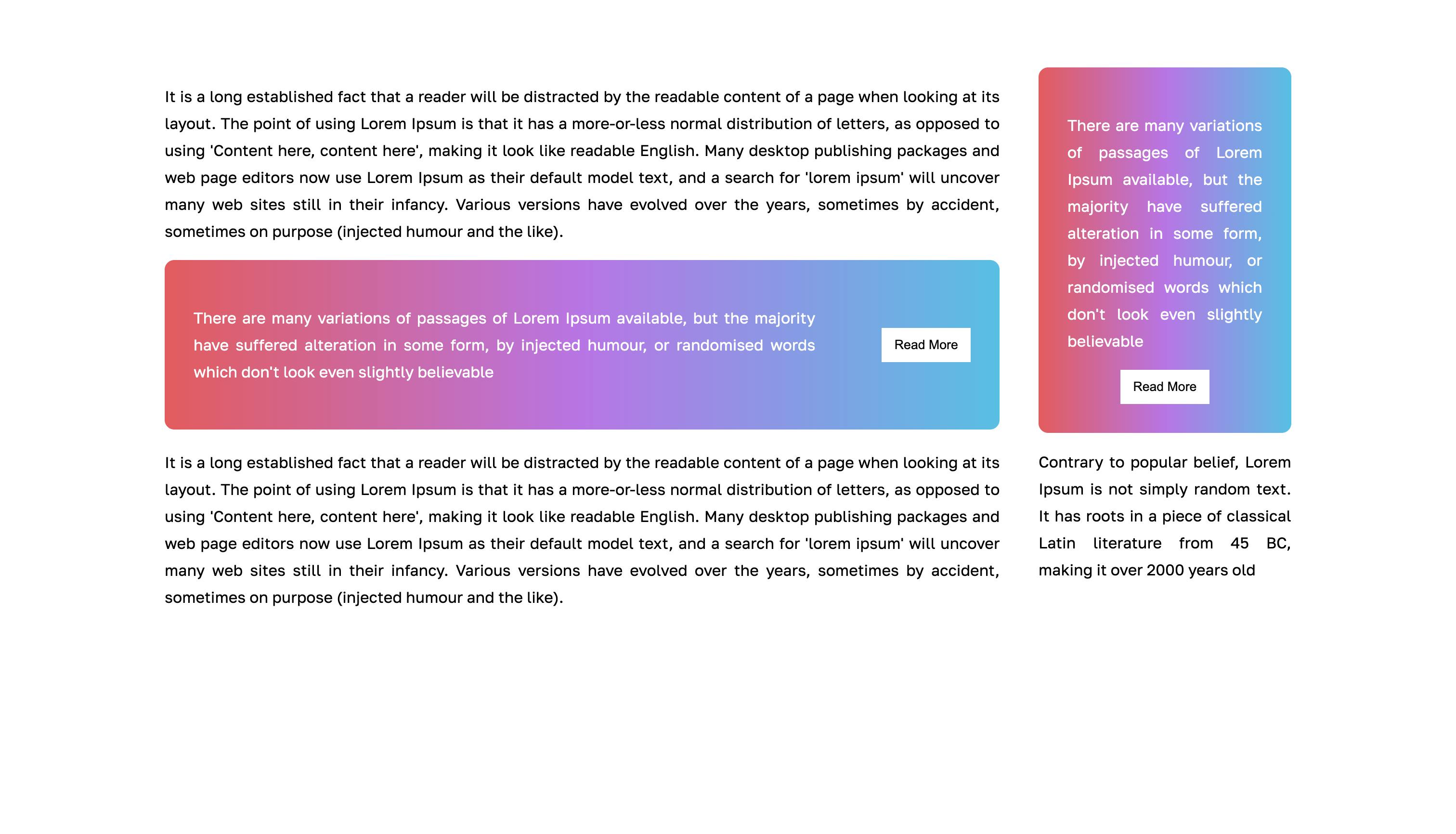
Once the container instance is defined, the container query can be used similarly to media queries, which we are already familiar with. This allows for the creation of different behaviors for the same component based on different container sizes.

And That's about it!
Thanks for reading and until the next time.

